Postman
Help centre
Postman is an API platform for building and using APIs. Postman simplifies each step of the API lifecycle and streamlines collaboration so one can create better APIs faster.
As Postman keeps adding more tools (tools are the different features that help building an API like Mock servers and Monitors) and complexities to the product, the number of doubts keep increasing and users start getting stuck. We foresaw the number of tickets increasing and picked up the help centre revamp.
This project involved of 1 designer, the Director of product support, the lead Program manager and various other stake holders from the support, marketing, bizops, marketing-engineering, customer success and sales teams. This project was driven by Cyrielle (Program manager) and me.
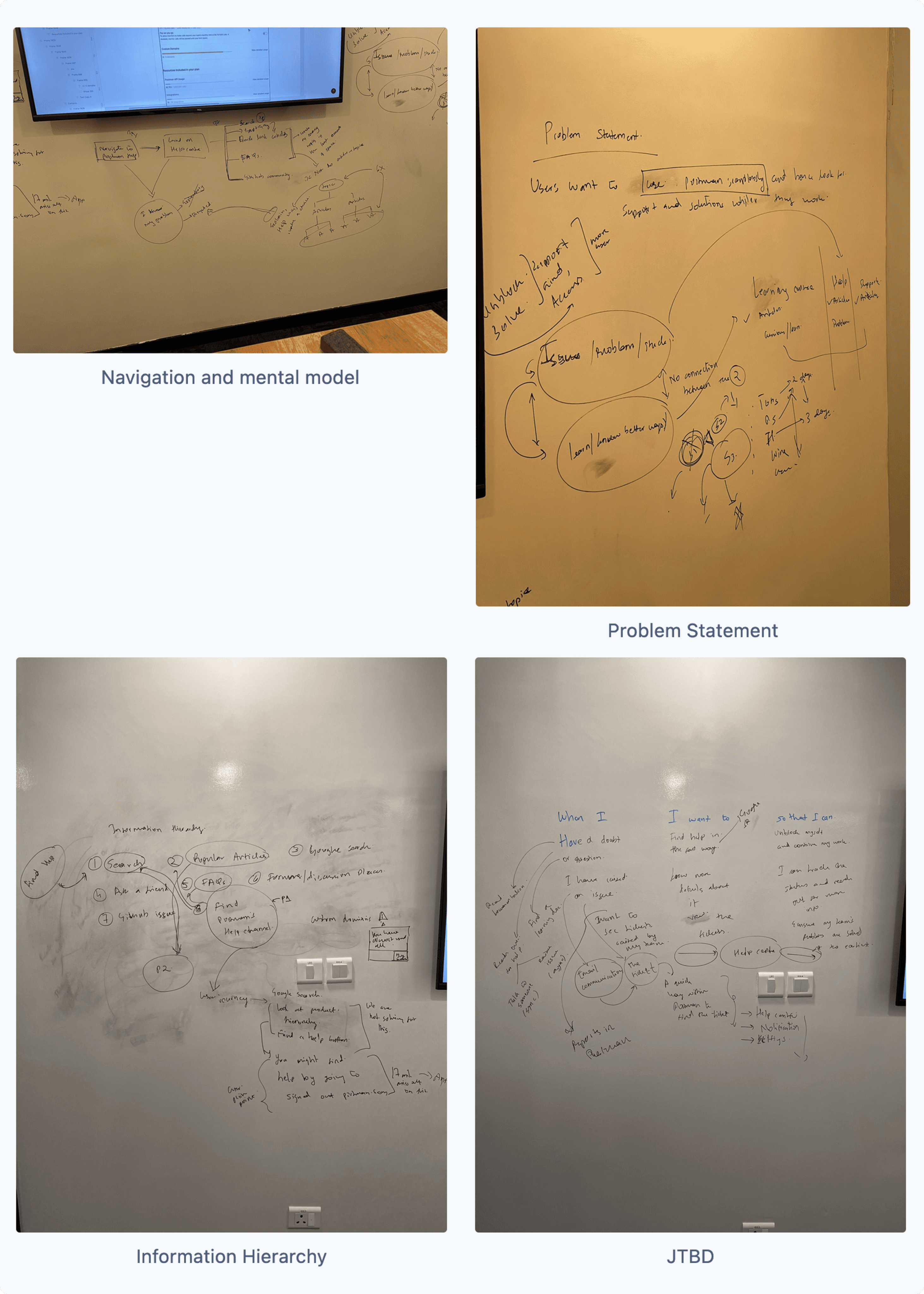
The problem statement
Users want to use Postman seamlessly and hence look for support and solutions while they work
Each help centre serves to unblock a user if and when they are stuck while performing an action. This helped understand what and where we needed to solve and improve the help centre.

Key pointers from the brainstorming exercise
We needed to improve the SEO for the help centre.
The search in the help centre needed fuzzy search.
Articles around new features needed to be surfaced.
Problem with status quo
The support centre and the help centre were divided into 2 different pages. This confused the users because they didn’t know which is the right place for them to get their problems addressed.
Both of these pages weren't easily accessible, which further fatigued the user.
The difference in the design language also threw users a bit off-guard.

Zendesk help centre research
Postman's help centre was built upon Zendesk's help centre. This did limit the scope but before that I went down a rabbit hole and looked at various help centres that were built on Zendesk. I also compiled a list of products from different sectors and broke the help centre down into specific sections.

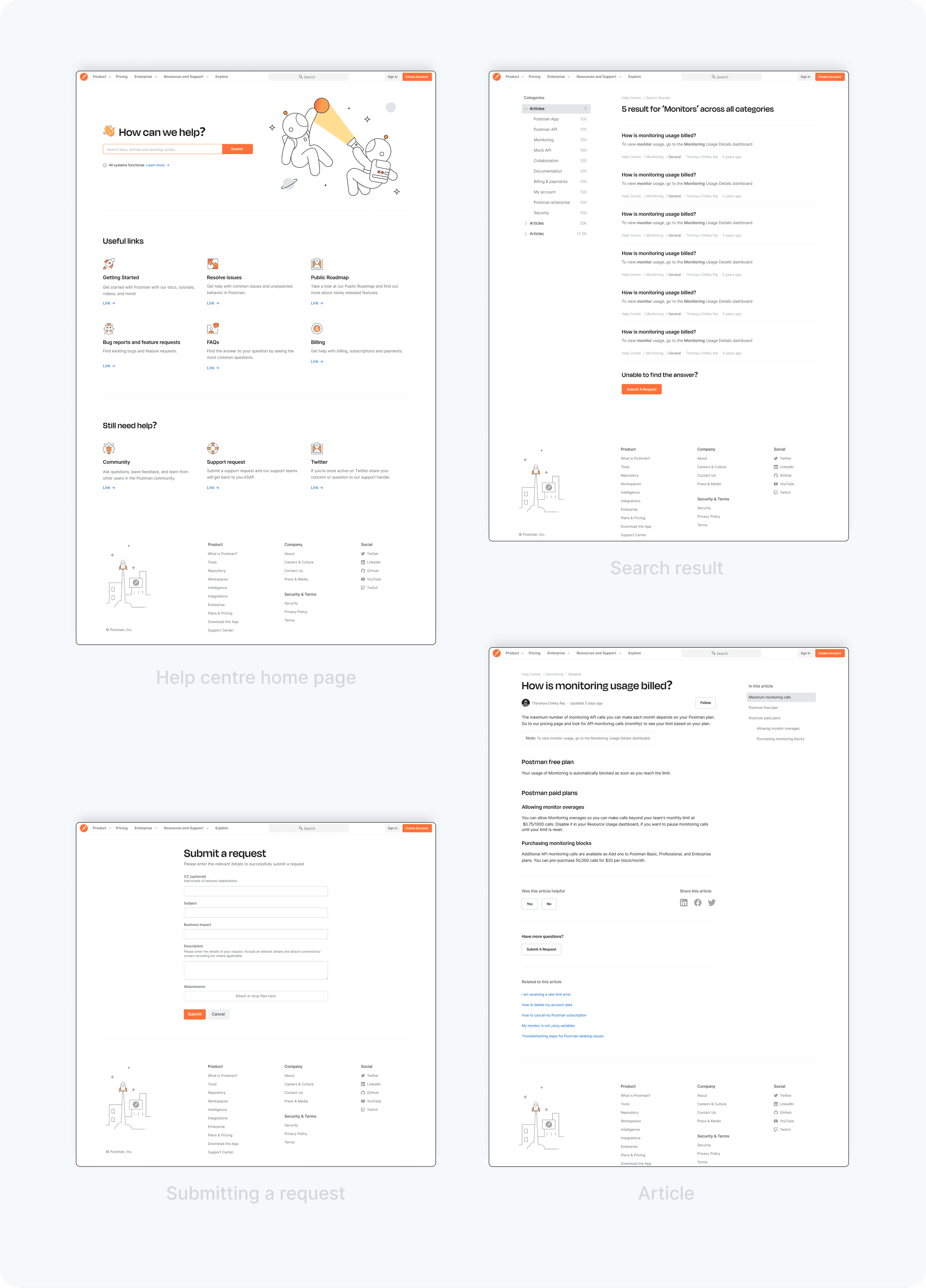
The final designs
After taking inputs from the various stakeholders, exploratory calls and a lot, a lot of iterations later we finally got the final designs ready.
Some key changes

4 important pages of the help centre

Metrics
We tracked 2 metrics for measuring success
Number of tickets filed regarding the same topic
Time taken by the user on the help centre, i.e. all pages other than articles
Learnings
Rapid iterations with faster review cycles helped keep people in the loop and allowed me to get insights from stakeholders not involved with the project.
With many stakeholders it is imperative to get the problem statement right. This ensures that one can sift through the noise.
This is a brief summary of the helpcentre revamp. If would like to talk more about this or see discarded concepts, understand it in more depth feel free to reach out to me. You can find my details on the home page. Thank you for taking the time to read this, till then This is the way!